Logo and Brand Identity
Banff Western Connection
Overview
Challenge
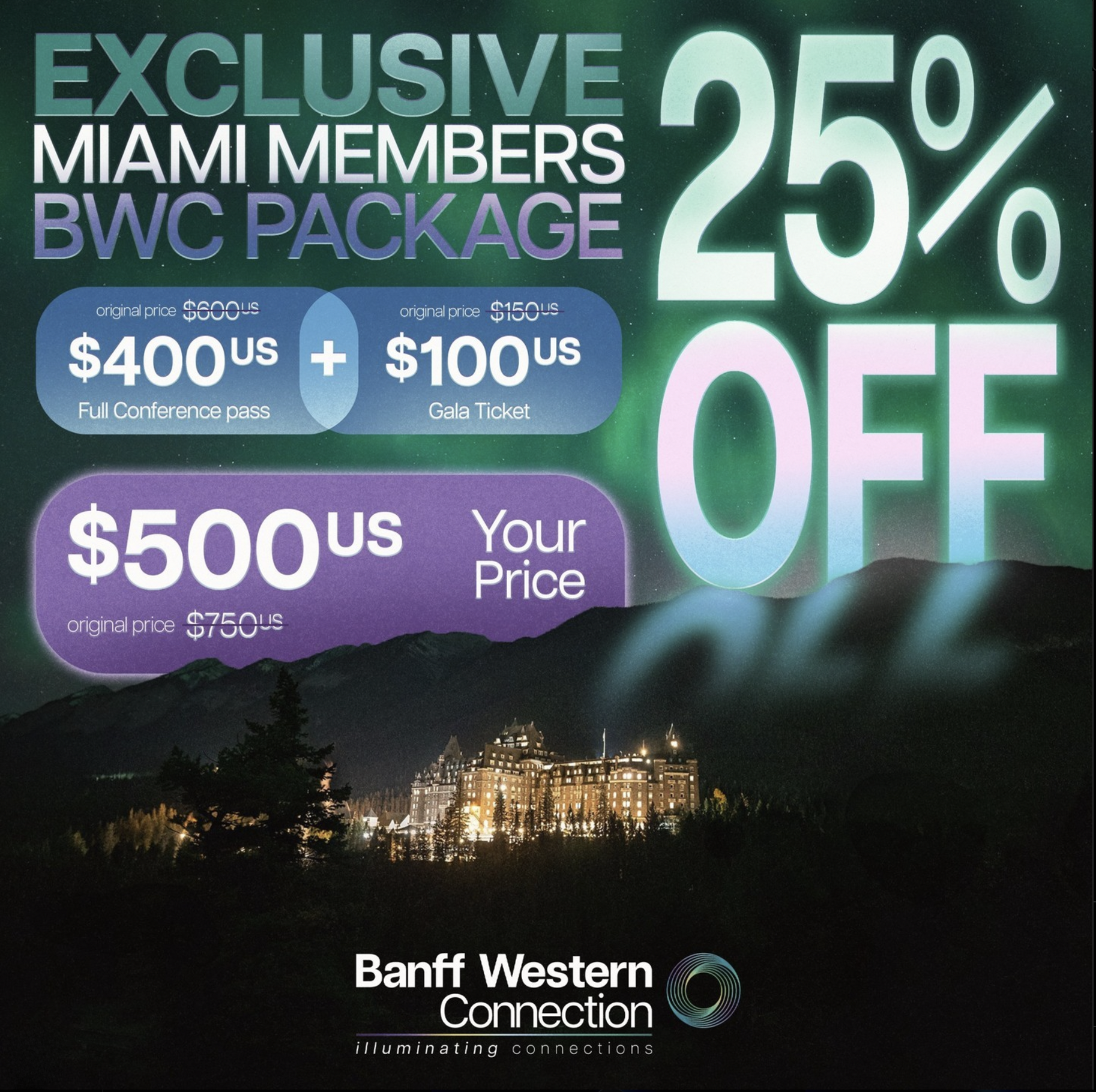
The Banff Western Connection needed a new logo and brand identity that captured the essence of its annual event while reflecting its unique theme for the year: "Illuminating Connections." The challenge was to visually translate the event's focus on forging meaningful relationships and sharing innovative ideas within the real estate industry, while also tying the brand to the natural beauty and inspiration of Banff, particularly the northern lights. The logo needed to stand out as modern and professional while remaining versatile for use across digital and print materials.
Transformation
Logo Design:
Developed a circular icon to symbolize the continuous nature of connection and collaboration. The interconnected loops evoke partnerships and the seamless exchange of ideas.
Integrated a gradient color palette inspired by the northern lights, using shades of green, blue, and purple to highlight illumination, inspiration, and unity.
Paired the bold, modern sans-serif typography for "Banff Western Connection" with a softer, elegant tagline ("illuminating connections") to balance professionalism with a sense of warmth and inclusivity.
Brand Identity:
Created a consistent color scheme reflective of the event's location and theme, ensuring the brand visually resonates with both the northern lights and the dynamic energy of the real estate community.
Designed the identity to be versatile, ensuring the logo and branding could seamlessly adapt to applications such as banners, merchandise, digital ads, and print materials (Exhibitor Prospectus, and Sponsorship Package).
Story
The new logo and brand identity successfully embody the mission of the Banff Western Connection: bringing together REALTORS® from across North America to build meaningful relationships, gain fresh insights, and inspire innovation. The northern lights-inspired gradient not only ties the brand to Banff’s iconic scenery but also symbolizes the illumination of ideas and connections.
This transformation elevates the event’s visual presence, ensuring the branding is modern, memorable, and deeply connected to the event's purpose. The result is a cohesive identity that reflects the brilliance of collaboration, the importance of connections, and the beauty of growth in the real estate industry.
Design Elements
Circular Icon:
The circular gradient design symbolizes "connections" with its continuous, interwoven loops. It evokes a sense of unity and collaboration, perfectly aligning with the event's theme of building and strengthening bonds across the real estate industry.
The gradient effect shifts between green, blue, and purple hues, mimicking the natural colors of the northern lights, which are central to this year’s theme. This design choice ties the logo to the location (Banff) and the "Illuminating Connections" theme, emphasizing illumination and inspiration.
Typography:
The modern sans-serif font balances professionalism and approachability, reflecting the innovative and forward-thinking ethos of the event.
The tagline, “illuminating connections”, is set in a thinner, softer typeface to contrast with the bold title. This creates hierarchy and subtly draws attention to the purpose of the event.
Color Palette:
The gradient colors from green to purple represent growth, innovation, and creativity—qualities that resonate with the event's mission of fostering new partnerships and sparking innovative ideas.
The colors also reflect the northern lights, creating a visual and thematic connection to the event’s geographic location and natural inspiration.
Tying the Logo to the Event
The logo encapsulates the essence of the Banff Western Connection through its focus on connection, illumination, and innovation:
The circular gradient represents the cyclical and continuous nature of building relationships in the real estate industry. It visually conveys how ideas and partnerships flow and grow over time.
The northern lights-inspired design reflects the event's location in Banff, connecting the audience to the awe-inspiring natural beauty of the region. This ties into the theme of "Illuminating Connections," where light symbolizes knowledge, wisdom, and the creation of opportunities.
How the Logo Enhances the Event
The clean and modern design ensures the logo is versatile, whether used on digital platforms, printed materials, or event merchandise.
The integration of the northern lights motif adds emotional resonance, connecting attendees to the event's location and its symbolic themes of inspiration and connection.
The tagline and gradient emphasize the aspirational and forward-thinking mission of the Banff Western Connection, making it memorable and impactful.
This logo effectively reflects the innovative, collaborative, and inspiring spirit of the event while celebrating its location and theme.